
Products Grados de más

Grados de más
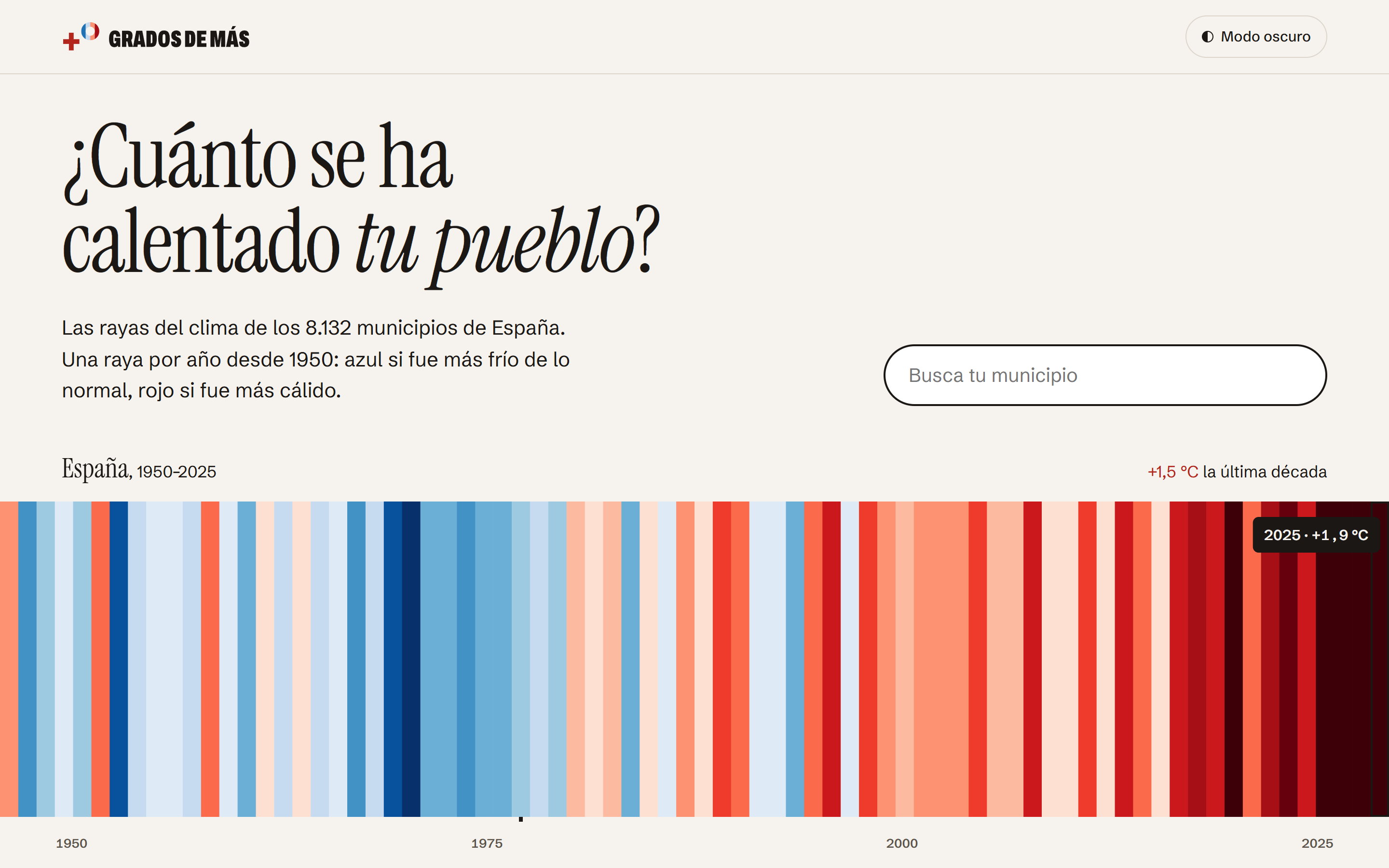
How much your town has warmed: the climate stripes of all 8,132 municipalities in Spain, one stripe per year since 1950.
The problem
Ed Hawkins's “warming stripes” show at a glance how the climate has changed: one stripe per year, blue if it was colder than normal and red if it was warmer. On his website, Spain has six cities.
We wanted anyone to be able to look up their town, see its stripes and share them, with figures that can be trusted and that are clear about their limits.
At a glance
Where the data comes from
- Temperature: ERA5-Land, from Copernicus
- The reanalysis from the Copernicus Climate Change Service: a grid of cells about 9 km across that reconstructs air temperature since 1950.
- Municipalities: IGN and INE
- The municipal boundaries and gazetteer of Spain's National Geographic Institute (IGN), and the list of municipalities from the National Statistics Institute (INE).
- Stations: AEMET and NOAA
- Stations from Spain's State Meteorological Agency (AEMET), to check the result and correct 1978, and NOAA's GHCN-M series, for checking only.
How we built it
Anomalies only, never temperatures
The temperature of a 9 km cell matches its average altitude, not the town's, and can be several degrees off. What we publish is how far each year departs from the municipality's own 1961–2010 average, which is much more reliable.
Checked against stations before publishing
We compared the result with 55 AEMET stations and 67 corrected GHCN-M series. Before calculating anything we set a criterion for accepting the data. It wasn't fully met: the grid shows slightly less warming on the coast and slightly more in high areas. We looked into it, adjusted the criterion and explained it on the website, with a notice on those municipalities' pages.
An error in the source data, found and fixed
Reviewing the stripes revealed a flaw in the Copernicus data: in 1978 the grid showed up to 5 °C less than the real figure in the west of the peninsula. We replaced it with what 82 AEMET stations measured, with a mean error of 0.13 °C, and marked it on the stripes of the 2,070 municipalities corrected.
Limitations in plain sight
With 9 km cells, a town's stripes are in practice those of its district, which is why there are no rankings between municipalities. Each page says what you need to know to read its figures properly.
Open data and a fast website
Everything can be downloaded as CSV and Parquet and queried through a documented API, under a CC BY 4.0 licence. Pages are generated in advance, so they load quickly on any phone.
In full detail
The full method, checks and limitations are in “Cómo está hecho”, and each source with its licence in “Fuentes y licencias” (both in Spanish).
Credits
Stripes format: Ed Hawkins (University of Reading), #ShowYourStripes.
Generated using or contains modified Copernicus Climate Change Service information 2026. Neither the European Commission nor ECMWF is responsible for any use that may be made of the Copernicus information or data it contains.
Información elaborada utilizando, entre otras, la obtenida de la Agencia Estatal de Meteorología.
Municipal boundaries: obra derivada de BDLJE Continua CC-BY 4.0 ign.es.